Through wireframes, we can test our product concept without spending much time and resources. But, do you know the actual difference between wireframing for mobile apps and websites? Is there any? Let us know.
Websites are accessed with HTML on your browser while the apps are downloaded and then installed on your smartphones or tablets instead of rendering them through browsers.
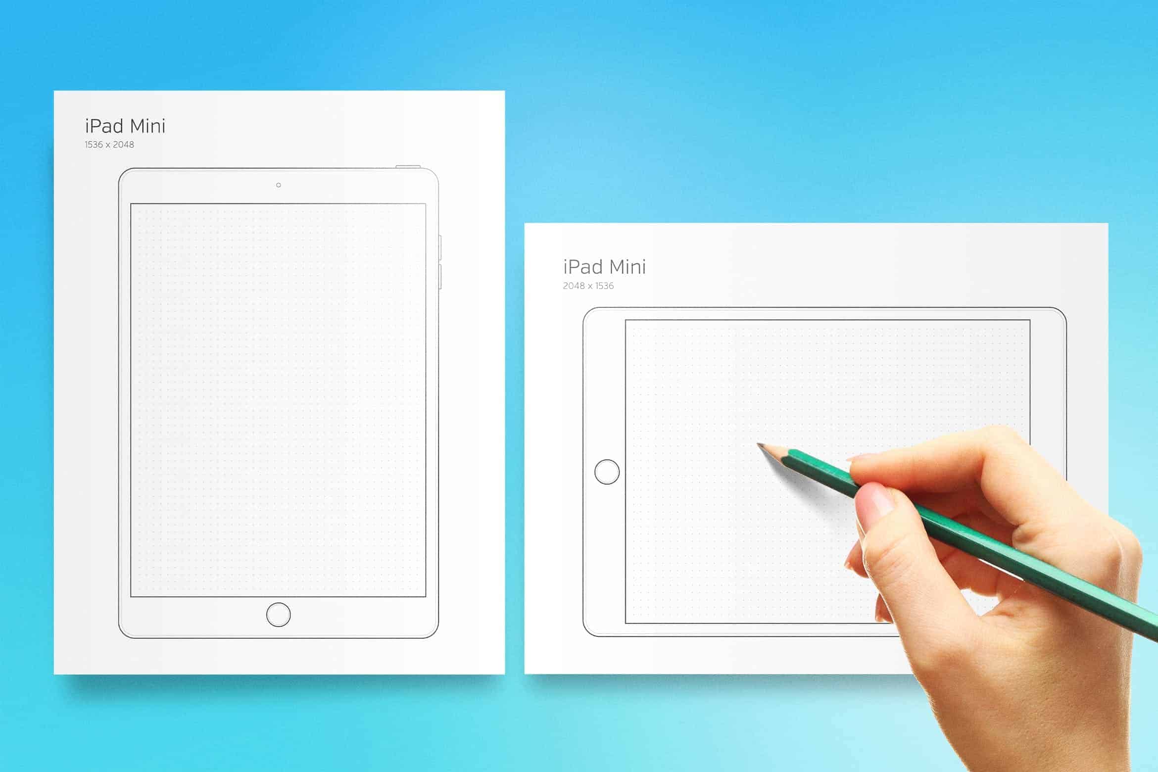
A wireframe is a static mid-level fidelity simulation of the product concept, portraying the skeletal framework of a webpage or app. Wireframes give a transparent outline of the page structure, layout, data architecture, and overall direction. Historically created in greyscale (without the utilization of colour), wireframes can be hand-drawn with pen and paper, or digitally using design software package.
Wireframing for mobile apps
Now that we’ve gotten to grips with some general wireframing best practices, let’s check up on the particular design heuristics to bear in mind while wireframing for mobile apps.
Finger-friendly designs
When wireframing for a mobile app, ensuring you’re adhering to each iOS and android platform standards are crucial. Before you even begin wireframing, ensure that your artboard is set up with the right ratios.
It’s equally important to make sure your wireframes are conforming to industry-standard tap target sizings. Tap targets refer to any part on a touchscreen device that a user interacts with using their finger. This includes something from a link to a button—or even a contact form.
Screen size limitations
Okay, therefore we’ve established that phones are smaller than desktops. Quite a lot smaller, for that matter. Of course, a wireframe is oversimplified by nature anyway—but notably, when wireframing for mobile apps, less is always better. Having a small interface with limited space means that your design must be compact, with transparent, obvious navigation.
Mobile interaction conventions
As mobile phones are designed to be used with 2 hands, this permits some specific gestures that you simply wouldn’t find using a desktop computer. Additionally, a mobile phone’s lock screen introduces some unique interaction opportunities. For instance, notifications are often expanded using 2 fingers to ascertain a preview of the contents and reveal key calls to action.
Time to test!
Now that your mobile app wireframe has been created, it’s time to test! Getting user feedback via user testing is just about the core goal of wireframing. Testing your mobile app wireframe can enable you to spot any points of friction, decipher the benefit of your app experience and gauge whether your screen flow matches up with the user’s expectations.
Wireframing for websites
Now that we’ve checked out wireframing for mobile apps, let’s have a look at what must be thought-about when wireframing for websites.
Nail your communication
Messaging could be a crucial building block in the website wireframing process. It’s imperative to work out what info you’re getting to show on the page, and the way that info goes to flow. Before you start incorporating your communication into your wireframe, take a blank piece of paper and find out what story you want every page to talk, and which piece of data should take priority over the other. This exercise can make you nail the flow of your communication and verify the goal of every page. It’s tempting to throw ‘Lorum Ipsum’ into your wireframes and be done with it, however the longer you spend nailing your messaging throughout the wireframing stage, the less time you have to pay on it later.
Dazzle with detail
Once you’ve established your wireframe’s basic communication flow, it’s time to feature some detail. You’ll have to outline your layout and spacing, usability conventions (such as inserting the navigation on top next to your logo, adding a tagline, or inserting the search box on the top right) and data hierarchy.
Multi-Modality
Consider that the same user would possibly switch devices for terribly specific ways to continue their expertise. For instance, users would possibly first encounter content whereas on a mobile device because they found a link via social media. Later, they could switch to the website to do additional in-depth analysis and build a purchase. Another example is browsing media content on a mobile app so streaming (or casting) the content to a media device like TV, console or speakers.
Time to test!
Just like mobile app wireframes, it’s currently time to test your wireframes along with your users.
So, yes, these are the basic differences between designing for desktop and mobile apps. Later on, we will discuss the differences between how the actual design process for these two works in details. Till then, hang on.