Creating a website requires paying attention to several aspects. While they might look insignificant from a distance, the result might drastically change with the incorrect choices. One such requirement is the color palette one chooses while creating a website or application.
Since the choices can profoundly impact creating an ideal UI design, it is necessary to make an informed decision. But how?
Well, the following guide will help you understand the meaning behind the colors to help you choose the ideal options for UI design. So, let’s get started without any further ado.
7 Tips for Choosing Colors for Creating an Attractive UI Design
Adhere to the following tips while choosing the color palette to help you create a UI design that appeals to the brand and the users.
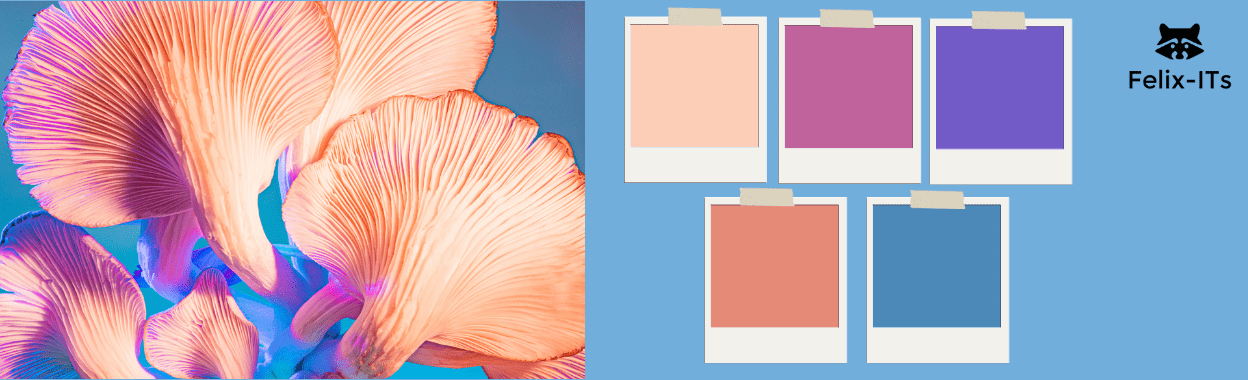
Tip 1: 60-30-10 rule
The 60-30-10 rule or technique is considered to have the highest importance in UI design. While it originates from interior design, it can be applied while creating an alluring website or application.
60% of the space should be a dominant hue, 30% should be allotted for the secondary color, and 10% for the accent color. Such a proportion makes it easier for the users to move their eyes from one point to another without discomfort.
Tip 2: Understand the Psychology of Colors
Since selecting colors can make it easier to create an easy pathway to attain the expected action, it is best to understand the introductory user psychology regarding the color palette. The right choice can help transfer the right message and brand tone to the users.
For example, red can symbolize love, anger, confidence, passion, etc. Blue is mainly associated with sadness. Purple denotes wealth and magic. Black is saved for tragedies and mysteries. White showcases authenticity and purity.
One of the best examples is the Pepsi logo. The color combination of red and blue against the backdrop of white creates a confident and sporty appearance, something that falls along the lines of the product.
Additional Read – Level Up Your UI/UX Skills: AI-Focused Online Courses for Designers
Tip 3: Create Contrast for Individuality
Creating color contrast for your website or application can enhance the UI elements and make the crucial features more noticeable. It can draw the users’ attention to the paramount parts of the space.
For example, contrasting colors can be added to the CTA buttons to make it easier for the users.
But extreme contrast might not always work. For example, choosing high contrast colors when it comes to the background and content colors can make it challenging for the users to read the text. This is why it is necessary for user testing before finalizing any decision.
Tip 4: Control the Saturation
Color saturation is the best way to create a vibrant website or application. While the power of saturation can be leveraged to attract attention, playing on extreme ends can overwhelm the eyes.
Hence, it is better to create contrast when it comes to saturation. Like, highly saturated color can be kept against a less saturated one to make it pleasing to the eye.
Tip 5: Opt for Color Variations
If you want to avoid taking a risk when it comes to color contrast, you can pick variations of the same color. You can pick a theme color for the background. The elements can be of the same color but with brighter or lighter variations.
Tip 6: Get Inspired by Nature and Art
Companies do not randomly choose the color palette for their websites and mobile applications. Intense deliberations and thoughts go into the process.
If you can’t seem to get any inspiration, you can try borrowing the ideas from nature and art. Follow the color pattern of the sky, sunsets, lake, etc., to get a soothing color palette for your UI design.
Tip 7: Undertake the Geographical Location and Gender Differences
Lastly, you must always consider the geographical location and gender while choosing the colors for the UI design.
For starters, some colors might carry different meanings in varying countries, and the same rule applies to genders. For example, women detest orange and gray, and men do not prefer purple and brown.
If your company or brand appeals to a particular gender from a set location, it is crucial to do additional research.
Bonus Read – Crafting Seamless Experiences: Top UI/UX Design Strategies for 2025
How to Use Color Psychology for Effective UI/UX Design
Colors invoke specific emotions, shape perceptions, and tend to influence decisions, thus making them an extremely important aspect of UIUX design. For instance, blue is commonly used to evoke trust, calmness, and reliability. It is the reason finance and healthcare brands that want to convey security use blue. On the other hand, red brings energy, excitement, or a sense of urgency- and so it is ideal for calls-to-action or important notifications.
On the other hand, black and white are often used for a crisp, minimalist look, allowing other colors to really stand out through the design. It’s such things that allow designers to align their colors in such ways that, based on their psychological effects, enhance a brand’s messaging and provide an interface that feels intuitive, memorable, and engaging to users.
Ace UI Design with Felix- ITs
Apart from the color palette and gradients, UI designs require an intensive knowledge of the tools and processes to get a flawless result. If you are planning to undertake such a responsibility in the future, it is necessary to gain theoretical and practical knowledge, which can be done with Felix-Its’ UI design course in Pune, Ahmedabad, and Mumbai.
Our UI UX courses in Mumbai, Ahmedabad, and Pune can be finished in under a month at the liberty of one’s home. This makes it convenient for working professionals willing to change their careers.
Under the guidance of industry-expert mentors, you shall surely be able to create an intuitive and visually appealing UI design in no time!
Contact us today to get enrolled.